
Teaching Programming for Kids

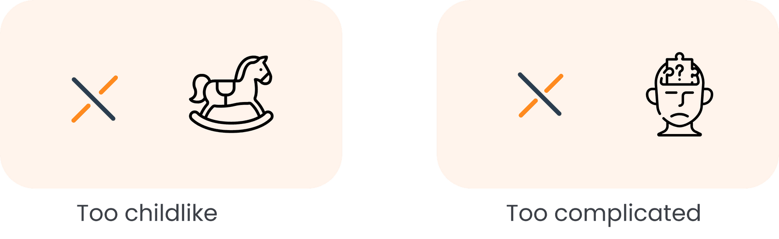
There's not too many apps to support their learning journey when it comes to programming or robotics, either it's too childlike so the kid get bored quickly or complicated, so he will be overwhelmed and lose interest.
Find the best approach to teach programming to children aged 9–12 tailoring the learning experience to their developmental stage and curiosity, and making coding education engaging, accessible, and age-appropriate.
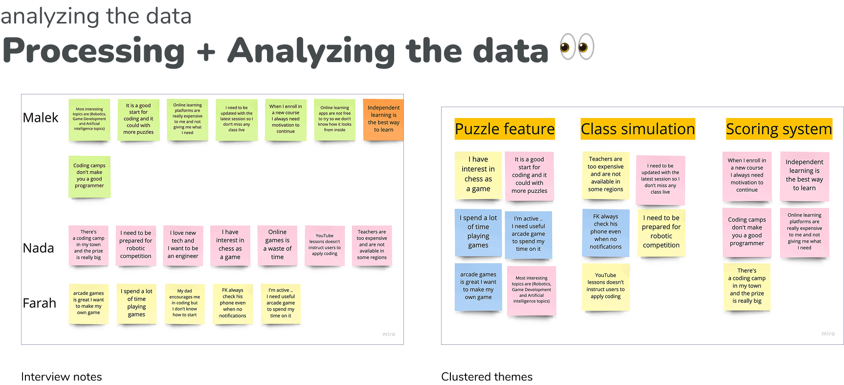
To better understand my little user, I focused on 3 main paths :
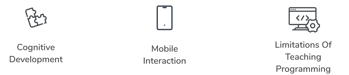

After a deep dive into child psychology and advanced methods for teaching programming, research shows that children between ages 7–12 understand the world more through logical thinking than through abstract concepts — meaning their learning requires concrete, intuitive interactions.
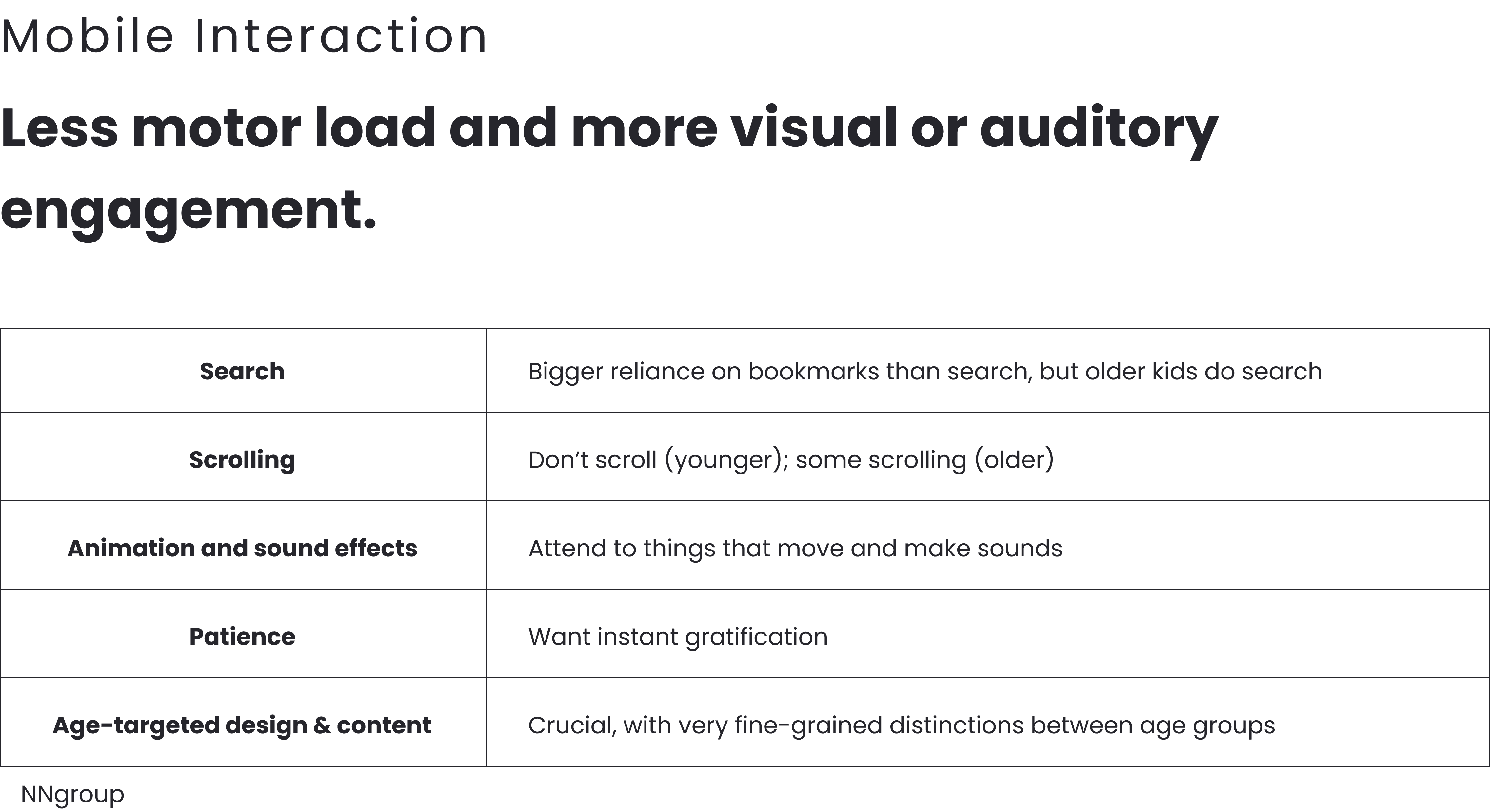

Many studies highlight that programming can be particularly difficult for that age group — complexity often overwhelms them, reducing motivation and retention.
Based on these insights and listening to the target audience’s experiences, the design direction was shaped to match the cognitive and interaction characteristics of 9–12-year-old children.
Ideation & Prioritization


Design Ssytem

Major Improvements to the Design
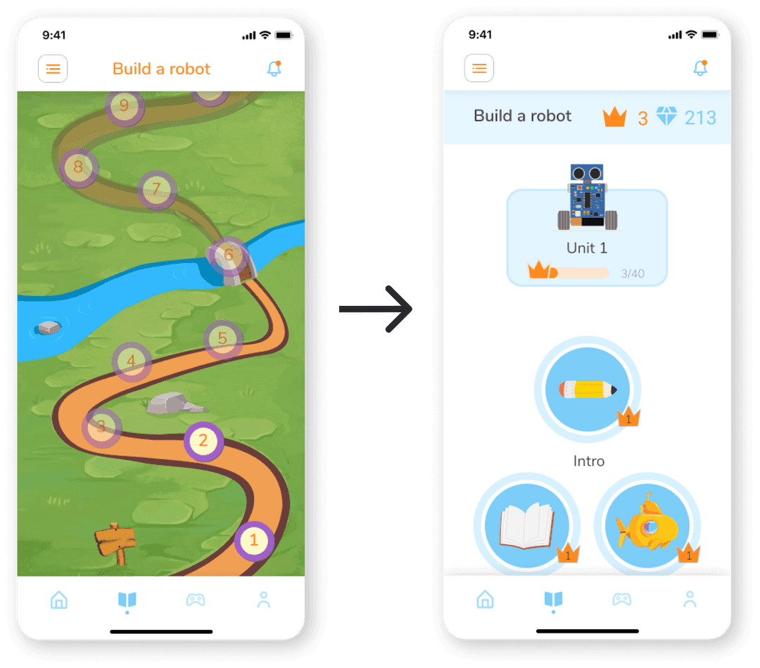
Changing the learning path layout
I found that the user reacted negatively to content designed for children that were even one school grade below or above their own level.
And they wanted to know more details about the next level without being too serious or too childish.
Remove Statistics
Originally designed to plant the accountability and encourage the user
Based on feedback, the user didn’t interact with the statistics on profile screen and that causes to lose the reason of adding it
instead, adding the same informations in big squares with refering icon had a great feedback.


Visual progressing bar
During the testing sessions, I found that most of the users are overwhelmed in the onboarding process.
Though I already added the step numbering but I found that this specific age get attracted more with visuals
Kody was my first full UX project. Through the process, many lessons were learned: the importance of iteration (over 9 Figma file versions), the need for intention in every design decision, and adherence to accessibility standards (e.g. planned WCAG compliance).
More importantly — beyond the deliverables — the journey gave a real sense of what working through a full UX process feels like. The designer realized that good design is not just about output, but about aligning solutions with real user needs, constantly seeking feedback, and being willing to iterate and improve.